- info@tandobeverage.com
- Mon - Sat: 8h00 - 18h00 (ICT)
5 easy steps to create the most inspired drink logo
A logo is not just a label attached outside your can, bottle, or on your social media post. It’s a part of that representative of your brand characteristic. So naturally, you want your logo to be distinct, easy to remember, and effective, but how do you get there? Don’t fret! This handy guide will show you everything you need to know about crafting perfect drink logos for your beverage business, understanding why you make ones to the fundamentals of logo design and steps to create a drink and beverage brand logo.
Why Drink Logos Are Important

Business is a lot like dating – you’re trying to attract the right one and make them fall for your brand. So relativity speaking, your logo is like a picture on your dating profile. It’s going to make them stop swiping and start a conversation with you, or they will end up liking your competitors. Here is why:
- Your logo is the first thing your audience will see: Acting as the face of the business, it appears on the facade of your store, outside of your package, on top of your website, etc. In this way, your drink logo design will create a solid first impression.
- A logo provides your target audience with information about your brand personality and message: Every element you have on your logo can evoke an emotional feeling devoted to your brand characteristic or messages about you. As a result, it means you have a chance to inform your customer what your brand is all about and let them know if it is right for them.
- Your logo will appear in almost every touchpoint you have: It stays on your websites, your campaign banners, your products, promotion emails, packages, coupons, gifts, and any place or thing you can think of. Your audiences pay more attention to your logo than you think.
A great, professional logo design can make remarkable impressions every time you encounter it. It not only can communicate what you stand for but also distinguish your beverage brand from the rest.
4 Secrets to Make a Great Drink and Beverage Logo Design

By now, you should have known how important it is to have a logo in this drink and beverage industry, no matter what type of beverage you sell. But not every logo can make an impact. Let us show you some key factors about a great drink and beverage logo design!
1. Call out appetite
Different from other industries, the drink and beverage logo design needs to produce the sensation of hunger. Think juicy-looking fruits for juice, mouth-watering burgers or fries for fast food, golden oak wood barrels or beautiful grapes for wine. See how tempting it is?
It’s essential to make your design look appealing and emphasize the attractive colors and imagery that can draw us in.
2. Reflect brand personality
Your logo needs to symbolize the kind of product you are selling and the kind of brand you want to be. A tea brand can make green leaf their logo symbol. It’s a safe choice but not the best.
Remember that your logo is an extension of your overall brand image and brand personality; it speaks on your behalf. So make sure to pay attention to every detail along the way!
3. Distinguish
Learning what your opponents are doing is not a bad thing but resembles with one is. You can learn a lot just by watching your competitors, seeing how their logo delivers their message, what works well with your audience, what you should avoid.
Still, when it comes to having your product on supermarket shelves, a logo that stands out is much better than those that look alike. It not only makes your brand easier to recognize but also sets a clearer view of how differences between your brand and competitors’.
4. Adapt to the upcoming changes
Your logo design needs to be timeless and lasting. People tend to build up feelings with their favorite drinks and beverages. Whenever they see your logo, they evoke a sense of familiarity. Therefore, as a beverage entrepreneur, a new logo can cost you a fortune and increase your chance of losing loyal customers.
What are the fundamentals of drink logos?
Before starting on creating your logo, it’s better to have some basic knowledge of logo design. Even if this is not your first time making one, it’s normal to feel confused. We will give you a quick cruise to view the basics.
Logo design is a slightly different specialization of graphic design. It comprehends aesthetics, branding & marketing, composition, color theory, typography, and artistic skill.
You are designing a logo for your brand personality
As you’ve read above, a great logo design needs to be a part of a system representing your brand personality. It speaks on your behalf and can only reflect yours alone.
For example, the green and fresh Tropicana logo is a good fit for that drink but obviously would not be appropriate for a pure water bottle like Dasani or Aquafina.
So before doing anything, you might want to know what kind of brand you want your logo to represent – your brand personality. Are you a fearsome, energetic energy drink or a more office-friendly one? A young and revolt fruit juice brand or a more healthy and relaxing brand?
That will get you a clearer view of how you’re going to design your drink and beverage logo, especially when you choose other visual elements like colors, shapes, and fonts.
Visual performance is the key

- Choosing the correct visual elements to bring out your brand personality can be a bit hard. Each color and shape carry different shades – for example, a logo design with black and vintage gold seems more delicate and classy. Meanwhile, the one with natural green color seems friendlier and fresh.
- The attraction also goes for the fonts. The fonts with doodle handwriting look friendly and playful, while those with thin and cursive strokes seem elegant and classy. Every design option you make reflects your brand, so make sure you build your drink and beverage logo from the ground up with strategic choices.
How to design an appealing drink logo for your business (in 5 steps)
Step 1: Evaluate your brand identity
This phase is also known as the question phase. Your goal here is to have a solid understanding of who your organization/company is, what your business believes in, what you want to accomplish, and how you want to get there. Remember, you’re not just designing a logo. You are shaping your brand identity.
While you think you know these things, it is better to go through the exercise of writing your answers down. Maybe there are some things you haven’t considered.
This checklist of question will help you get a clearer view of what your brand is all about.
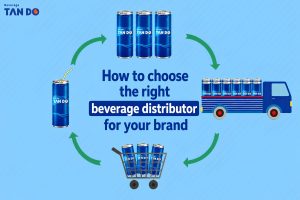
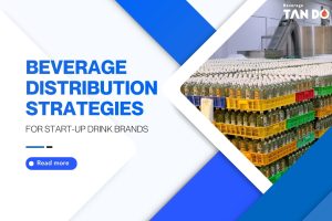
- Why do you need and/or want a new logo?
- Who are your target audiences?
- Who are your main competitors?
- What do you do better than anyone else?
- What makes you unique?
- How do you describe your brand personality?
- What are the exact characteristics of your brand’s personality that make you stand out?
- What are the values you want your brand to express?
- What do you want your audience to feel when they encounter your logo?
After you’ve answered these questions, you’ll have a summary of the answers in a creative strategy that provides an overview of your business. Not only will this strategy document help to guide your next phase, but it’ll also be used to judge your performance throughout the process. At the end of each stage, evaluate your outcome by how well they fulfill the creative strategy’s vision.
Step 2: Find inspiration for your logo design
This design is your research phase, but it’s a bit more exciting than that. Compared to others, this phase is the most fun and helpful. Basically, you’ll be turning your focus outward to explore design out in the world. Your goal here is to get inspired.
The thing you want to be focused on at first is gathering information. Look first to your competitors, then to your broader industry. Don’t just look at logos. Experience the entire identity by observing brands across multiple channels like websites, different social networks, etc. Take notes. What elements stand out to you, both bad and good?
Next, look outside your industry. Explore what’s trending among the design community. Look to websites like Dribbble and Behance for recent creative artwork from the world’s leading designers, or just search for it on Instagram.

Your goal here is to create a mood board to collect all the images, designs, color combinations, photos, illustrations and, yes, logos you feel drawn to and represent the look and feel you want for your brand identity. Your mood board will reflect what kind of style and design features you are gravitating.
If you’re attached to several design directions, create separate mood boards for each. Be sure to include a short description of how each board’s visual choices express the brand attributes detailed in your creative strategy.
Step 3: Design your drink logo artwork
Finally! The goal here is quite straightforward: Take all the thoughts and inputs from the first two phases and generate some logo designs.
There’s a lot to look at when approaching how to design a logo:
Tools
Before you start, be sure you have what you’ll need to design:
- Paper and pencil: Sketching some basic ideas is a great place. Even if you can’t draw, create rough sketches of the pictures in your mind. Your brain will be forced to think creatively, which is precisely the mindset you need.
- Vector graphic design software: All logos are vector images, meaning that instead of pixels, they’re made up of lines defined by mathematical formulas. Vectors are easier to scale and modify.
- Fonts: If you go the above route, you may want to download some additional fonts. Some free font resources are the Google Fonts library and Font Squirrel.
Types of logos
Whether you decide to use a template or design your logo from scratch, a good starting point is to educate yourself with the seven types of logos:
- Lettermarks (or monogram logos): Monogram logos or letter marks are logos that consist of letters, usually brand initials, for instance: IBM, CNN, HP, HBO…
- Wordmarks (or logotypes): Like letter marks, a wordmark or logotype is a font-based logo that focuses on a business’ name alone. Think Visa and Coca-Cola.
- Pictorial marks (or logo symbols): A graphic mark (sometimes called brand mark or logo symbol) is an icon—or graphics-based logo. It’s probably the image that comes first to mind when you think “logo”: the iconic Apple logo, the Twitter bird,…
- Abstract logo marks: An abstract mark is a specific type of pictorial logo. Instead of using a recognizable image—like the Apple logo or Twitter logo from above—it’s an abstract geometric form representing your brand. A few famous examples include the stripy Adidas flower and the Pepsi divided circle.
- Mascots: A mascot is simply an illustrated character that represents your brand. Think of them as the ambassador for your company. Famous mascots include KFC’s Colonel, the Kool-Aid Man and Planter’s Mr. Peanut.
- Combination mark: It is a logo consisting of a combined wordmark or letter mark and a pictorial mark, abstract mark, or mascot. We layout the picture and text side-by-side, stacked on top of each other or integrated to create an image. Some well-known combination mark logos include Doritos, Burger King and Lacoste.
- Emblem: An consists of font inside an icon or a symbol; think crests, seals and badges. These logos tend to have a traditional look about them. Thus they are often the preferred choice for many government agencies, schools and organizations.
Fonts
If you decide to go with a wordmark or letter mark, remember how vital typography is. Similar to colors, different fonts bring out different interpretations of your brand personality.
There are countless types of fonts, but they all fall into three families (also called typefaces): serifs, sans serifs, and script.
Step 4: Refine

If you are well prepared, you will have several different options from the last phase, now is the time to narrow it down. You can evaluate your designs by asking yourself these questions:
#1 What makes an excellent logo?
A great drink and beverage logo design are:
- Easy to call out appetite
- Reflect brand personality
- Distinguish
- Adapt to upcoming changes
#2 Where will you use this logo?
Consider both your primary use-cases like your website or social media profiles and your secondary use cases, like printed marketing materials, recruitment materials, event banners, etc.
Don’t stop at considerations. Test it on various backgrounds to make sure the image, words, and overall message translate across every medium. Any logo mark should be effective in many sizes, but small, digital applications are critical.
Step 5: Define

At this step, you should have a final logo design you love. And most likely, it takes you a decent amount of time to get every element just right. So to keep it that way, quality and consistency are key.
You need to consider how many places your logo will live and how many people may need to use it. Therefore, it is crucial to clarify a set of rules and guidelines for using your drink and beverage logo design.
At the start, consider any guidelines you may have on your logo’s size, color, layout, treatment, positioning, orientation, etc.
Here are some questions which will help you out:
- What are the suitable background colors for your logo?
- Can your logo be well applied to photos? If not, can you change the color to help it stand out?
- If you have a combination logo, can the features be separated in specific contexts?
Don’t hesitate to add more rules to prevent any distortions or modifications to your logo. Otherwise, your banner or media post would become a colorful fiesta.
5 Common mistakes when designing a drink logo
Before getting everything started, you should know a few ground rules for a drink and beverage logo design.
Mistake #1: Not define the whole visual system when designing logo

A logo is a part of the bigger picture. What you need isn’t just a logo; you need a brand identity! When it comes to startups and new entrepreneurs, many of them only demand a logo to put on their email, website, etc.
A logo is great, but it’s just a part of the picture, not the entire thing. They are just one image within a more extensive visual system that includes color, typography, photography, layout, optical, etc.
Mistake #2 Unconsciously follow the newest design trend
It’s not entirely a bad thing to follow directions when designing your drink and beverage logo. The risk of these trends is that they can only swing for a period when your logo needs to be timeless. If it is designed as per the trends, then it may start looking cliche and dated soon.
But still, you can always take inspiration from the movement, just make sure that your logo design is long-lasting.
Mistake #3 Use too many typography styles

It’s best to keep your logo as simple as possible. Don’t use too many weights or fonts (two is maximum). Using too many will give your design a chaotic look.
Mistake #4 Use too many colors
It could work sometimes, but unless you are selling lucky charms, it is generally not good to use every color as possible. Using too many colors signals that you can’t decide what palette to go with, which in turn makes your brand character unclear and, therefore, less likely to resonate with your target audience.
Mistake #5 Confusing scale
Scale can have a significant impact on how we process an image. Even a simple change in the scale of your logo elements can make a big difference. A mistake people commonly make is having a considerable logo mark with a teeny-tiny line of text.
3 great examples of drink logo design in the beverage industry
1. Redbull

Red Bull’s logo is perhaps one of the most distinct yet iconic foods and drinks sectors. Consisting of two massive bulls a moment before the collapse and a yellow circle (whether viewed as an impending explosion or the sun) – you would find it extremely difficult to find a logo that reaches out “potential energy” better than this.
Several components in the logo further support this personality.
- Symmetry in the logo – the two identical bulls are preparing to clash akin to the concept of “the unstoppable force and the immovable object.”
- The yellow circle in the background
- The “energy” that outlines the bulls, precisely insofar as it is the same color as the circle in the middle.
- The colors are well-chosen, red and yellow are “hot” colors, which have many implications that support Red Bull’s brand values.
2. Fanta

When it comes to the Fanta brand logo, you can already make out this is for a consumable drink product, and many things indicate that.
- The circular orange shape has been used to represent the flavor and name of the Fanta Orange product. The Coca-Cola Company has also used an orange fruit leaf’s imagery to indicate further what this drink is all about.
- A bubbly typeface placed on the logo represents the idea of it being a fun and energetic brand and product.
- The colors on the logo indicate where the product might be consumed; such as a music venue, festival, beach, or any other similar location or venue.
This logo tells us that the primary target audience for Fanta Orange is the younger audience, as they’re the more significant population at these kinds of events, but this doesn’t mean that older age groups can’t purchase this drink also.
3. 7Up

The 7Up logo is fun, bubbly and energetic. It’s a design that fosters a sense of creativity, authority and amusement. This is a logo full of enthusiasm and youth, filling consumers with that fizzy delight the soda itself is known for.
This creative and fluid logo is colorful, cool and dynamic. It’s a swift and smooth design that is instantly eye-catching, with a recognizable quality that’s lasted throughout the years.
- The wordmark 7Up is made up of a bright green outline with a fluid and bubbly sphere separating the seven and the Up. The curvy and swirly nature of the design eliminates harsh lines and geometric pointiness. It’s soft. It’s stunning. It’s smooth. It’s a design that demands attention and gives users a sense of fulfillment.
- There’s a three-dimensional quality to this design due to the white lettering and bright, green outline. The seven stands solid and robust, promoting the brand’s original seven ingredients.
- The bright red sphere emphasizes the bubbly and fizzy nature of the drink itself. And it adds a playful quality to the design that elevates the brand’s creative enthusiasm and personality.
- Green is a refreshing color. It reminds us of the lush green outdoors that calms our senses. Green is classic and modern, naturally crisp and clean. It’s never aggressive or dull and always a cool and refreshing lemon-lime flavor, just like Sprite.
All in all, this logo design takes on a retro edge that calls back to the brand’s roots.
The 7Up logo has gone through different iterations over the years. However, it’s still retained the modernity, creativity, and branding of the latest version. 7Up is a brand that promotes joy and excitement. And this design puts the brand’s personality front and center.
Conclusion
Before starting anything, you should know this: Creating a drink logo design is an exhausting job. Our 5 steps guideline is easy to understand but it can take you weeks to work through. Your final logo artwork will reflect the level of effort you put into it. Just remember to follow strictly the 5 steps mentioned above and avoid those common mistakes.
We hope this post is helpful to you. If you want more posts like this, just take three seconds to subscribe to our latest newsletter and you won’t miss any valuable tips for your beverage business.
Tan Do is a global beverage ODM/OEM manufacturer and supplier located in Vietnam. Since 1996, we have built trust and credibility not only throughout Vietnam but also in many parts of the world. Leveraging state-of-the-art technology, we have crafted thousands of products that align with ISO, HACCP, HALAL, FDA, and many other standards.